Separate the subject from its background
Crop around what matters. A clear subject and a simple background reduce distracting details. For a portrait, pay particular attention to the eyes and the main shadows.
Compare several sizes
A larger pattern retains more detail but takes more work. A smaller pattern suits simple shapes. Compare the overall result, then zoom in to inspect important outlines.
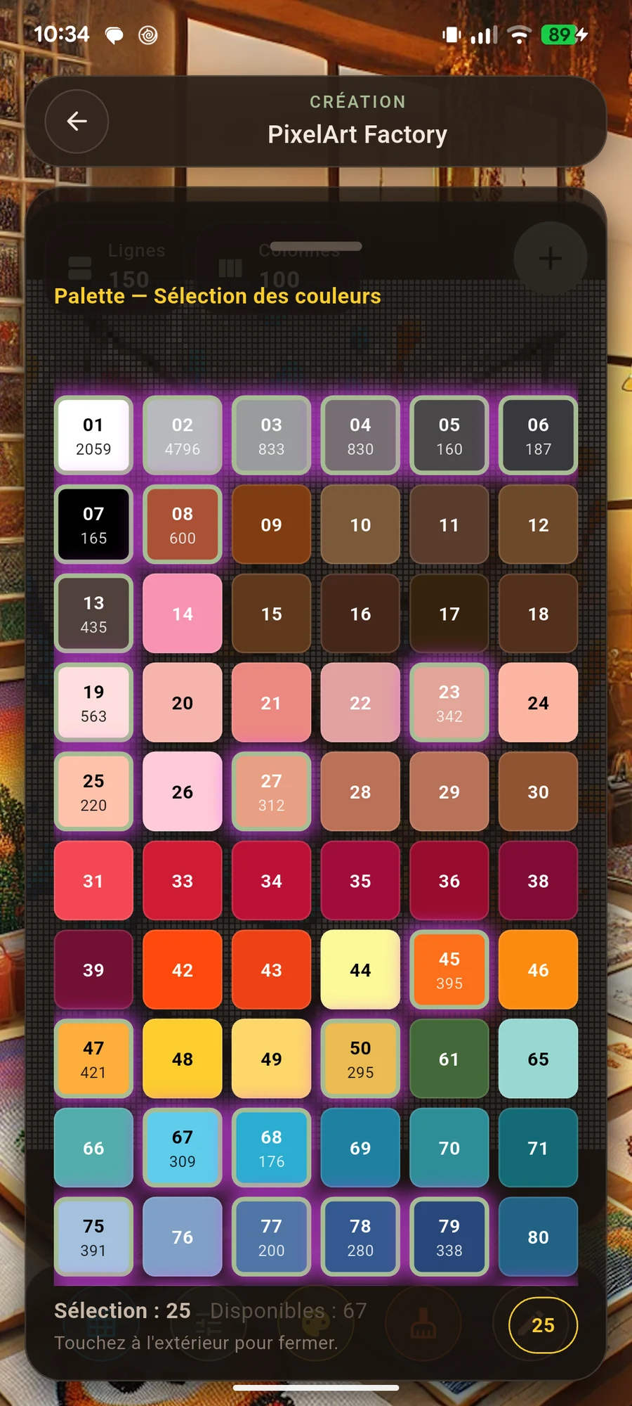
Choose useful colours
Keep contrasts that make the design recognisable. Several almost identical shades may complicate the piece. Simplify gradually while checking shadows and outlines.
Compare the screen with your materials
A screen cannot guarantee the exact shade of yarn or beads. Place your materials side by side and check their contrast under suitable lighting before you begin.
Edit isolated details
Correct pixels that blur an outline or add an unnecessary colour change. Preserve the subject’s essential features rather than every detail in the original image.
Before you start
Check your design, materials and the actual project size. The best settings are those that let you enjoy making your idea.